There is a reason everybody calls their house a ‘home sweet home’. After all, it is your personal space and it is supposed to give you relief and rest. The reality, however, is that homes are often the common source of stress. What is problematic, though, is that there are times when you know that there is something wrong in the space, but you cannot exactly put your finger into it. Due to that, you become restless and distracted, as you think about such a trivial matter for an entire day. It can even bother you for days every time you come home.
To help you in this dilemma, here is an outline of the common design elements in homes that secretly zaps out the sense of comfort and pleasure in the space:
1. You set the wrong mood
You may have created a wrong atmosphere in your space because of the colour you used. When designing a space and choosing hues, you cannot just consider the aesthetic, you also have to know the psychology behind it. Certain colours work well for specific rooms, as they evoke a unique emotion.
For instance, blue and green are ideal for the bedroom, as they offer a sense of rest and relaxation. Neutrals like white and light grey are also a good choice for that calm feeling. When choosing design elements, stick with the colours that correspond to a particular emotion. You can easily see what your options are by looking up bedroom furniture online. UK interior designers strongly recommend checking out furniture websites, so you can envision the right mood for your space.
2. You forgot textures
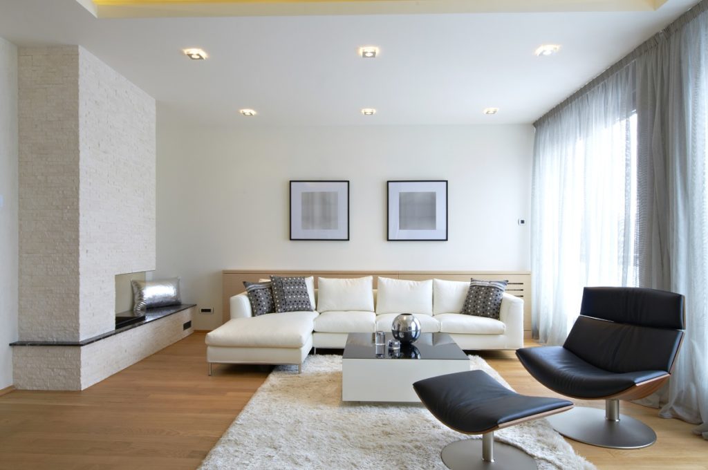
 The texture is a design principle many homeowners overlook. This then leaves their space flat, monotonous, or cookie-cutter-looking, which makes their home look like it is lacking something. Prioritise the textures in your space to bring out a little bit of character and warmth in it. If you have a sleek, modern space, then adding soft materials like faux fur rugs or plants can increase the atmosphere of comfort in your area. On the other hand, if you have a neutral-coloured, snug-looking space, better complement it with bold metal accents on cabinet hardware to add smooth design details.
3. You have too much wall art
Having a mini gallery of family photos and art pieces is okay, but a wall filled with embellishments that leave no white space? That’s overstimulaton. When the brain processes too much information at the same time, it goes into overdrive, leaving you restless. Remember the value and aesthetics of negative space: there has to be a resting corner for the eyes and the brain, so you could appreciate better the entire design. Go easy on the wall art or if you really want to go bold in one corner, tone down all the rest.
Is your home secretly stressing you out? Chances are, you committed these design mistakes. With just a few tweaks and fixes, you can transform your space into your home sweet home again.

